When Collecting
Becomes A Showcase
For the past few years I have been collecting CDs of music releases ranging from well known albums to obscure diamonds in the rough. Every month I would receive a package in the mail containing around ten carefully selected goodies and proceed to post them on my Instagram story in hopes of inspiring others to give new music a try. However, after some time I realized I could push this further by making this into a monthly, educational installment through a series of Instagram reels!
The only thing missing from the recipe was a proper design language.
Finding The Skeleton
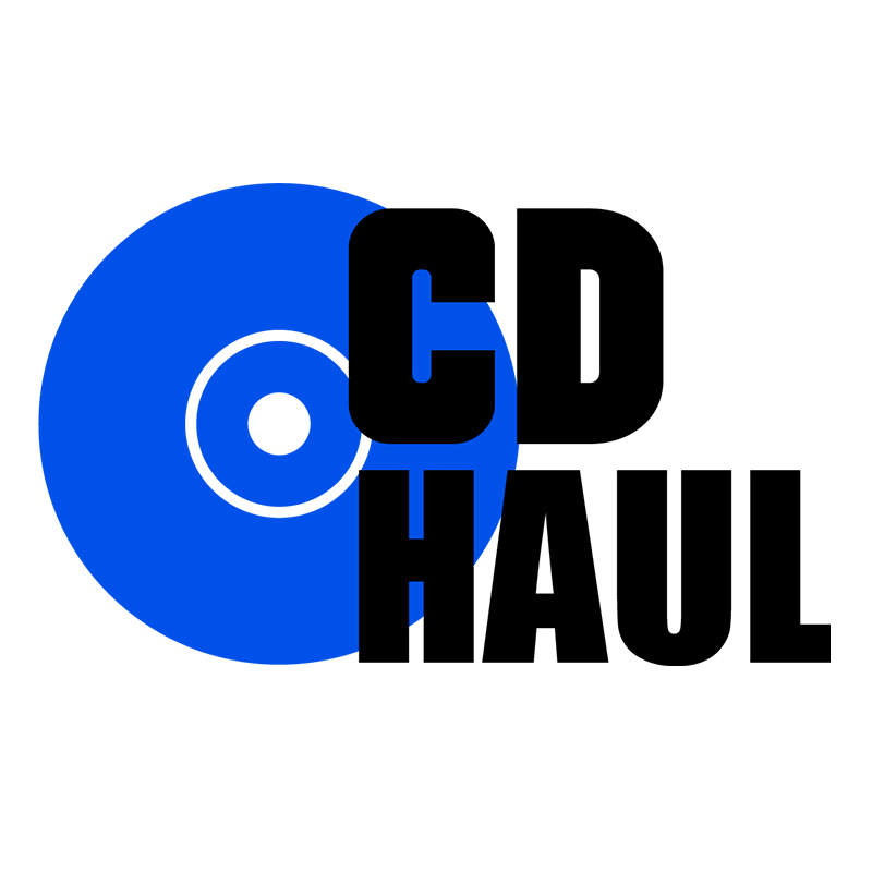
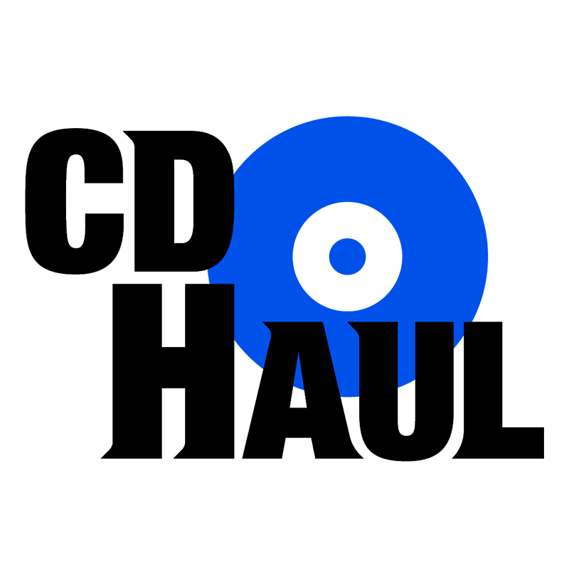

From the start I knew I needed to incorporate the shape of a compact disc within the logo composition. Starting in Adobe Illustrator, three drafts were born after playing around with arrangement, different discs, and text styles. I think it's apparent which one was immediately my favorite given the more detailed font.
A big part of my style in logo design is making each piece feel alive with texture and lighting. As I child I couldn’t stop myself from being mystified on how my favorite video games and movies had these detailed logos that would catch the viewer’s eye. Over time that youthful curiosity became apart of my stylistic identity as I learned more and more about design.
With that being said, I hit a small road block on how I was going to render the CD. I was very against stylizing the disc with minimalism, let alone the entire logo. Would I 3D model it? Mask a gradient over the shape? What if I want this component to be animated?
It’s Alive!
The approach on rendering the disc was straight forward after booting up Photoshop:
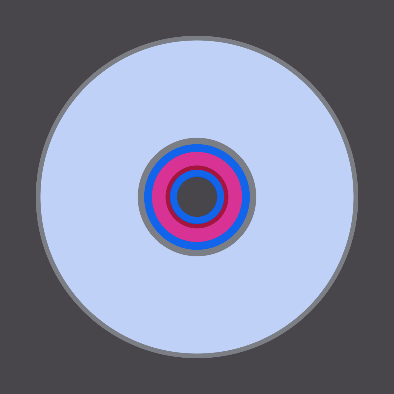

To achieve an accurate depiction I made multiple rings within the base circle to utilize as foundation layers to achieve the transparent plastic rings you find within the middle of a disc. After that I made more inner rings that would serve as the secondary reflective material found on the inner and outer areas of the disc.

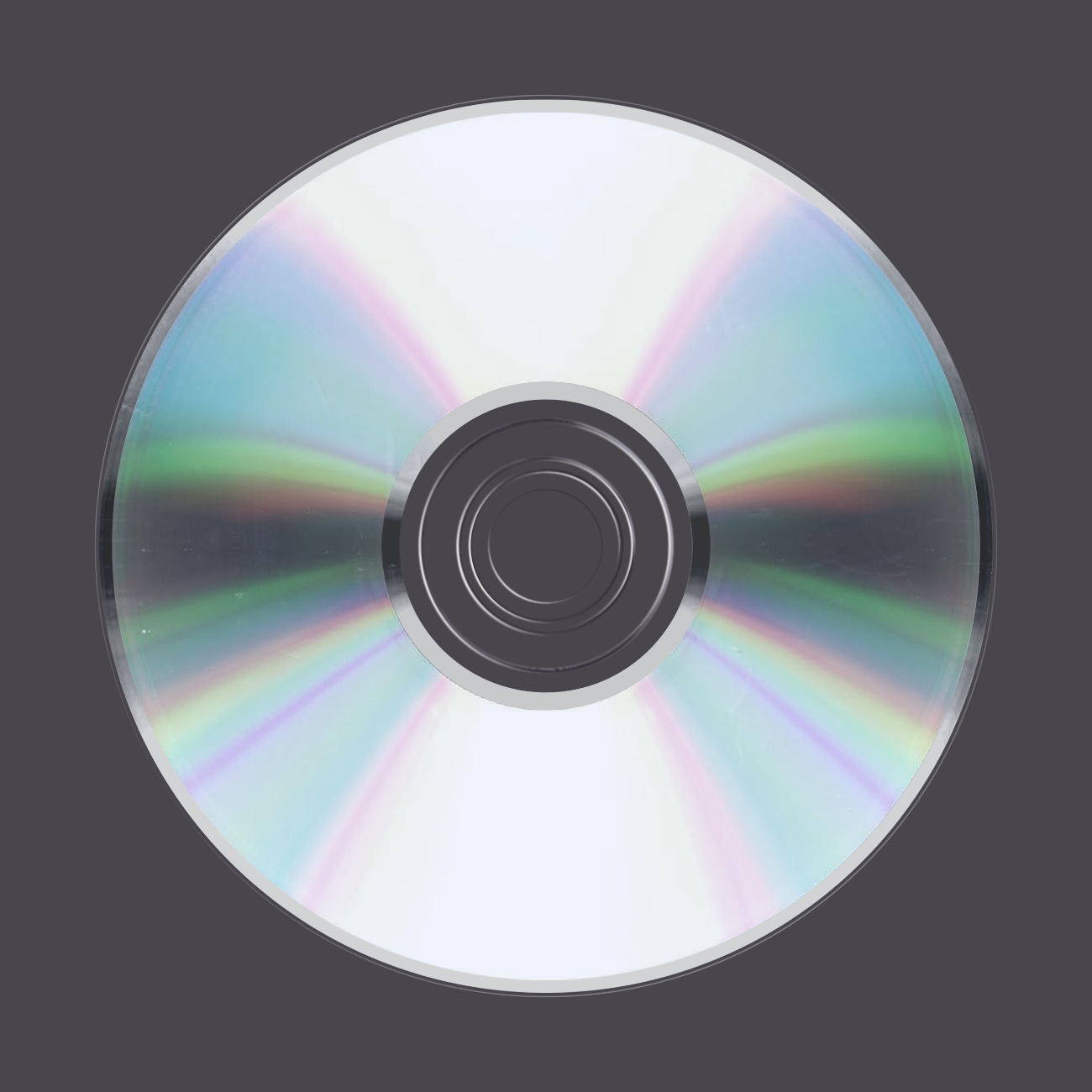
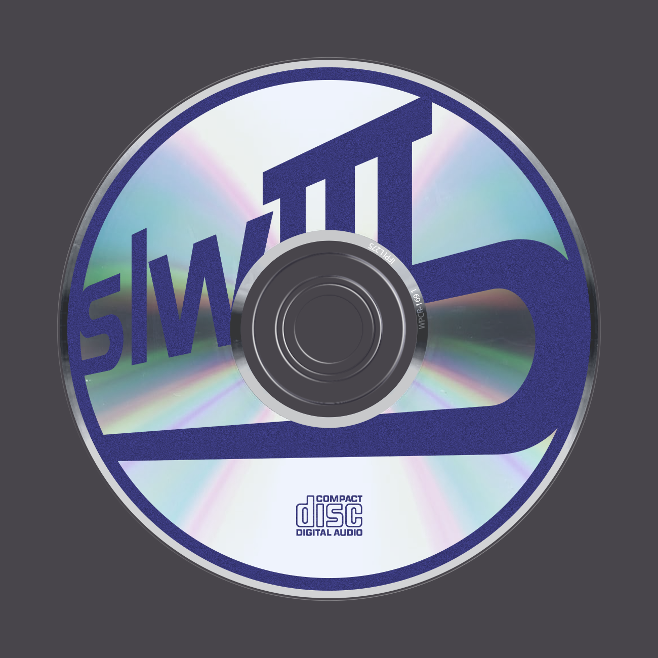
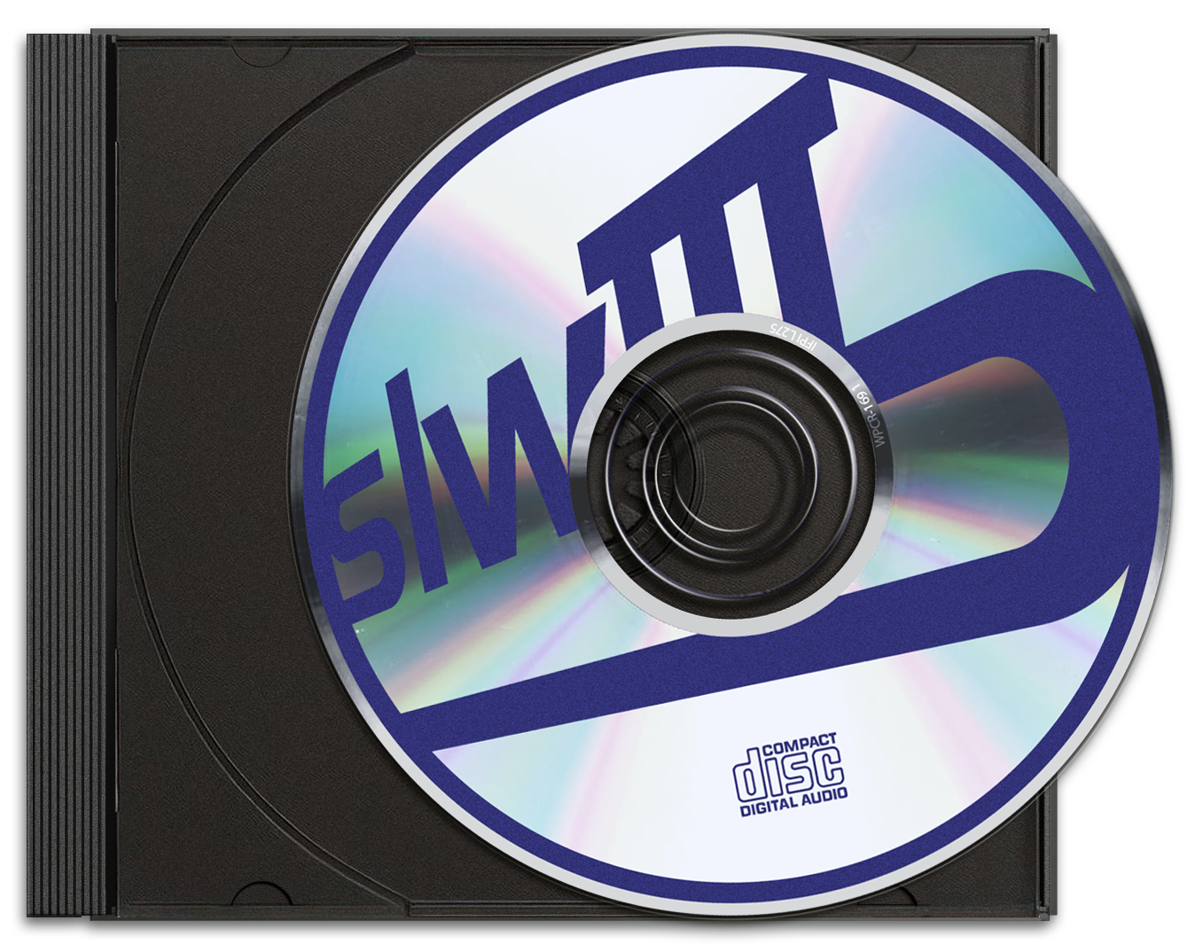
The disc component starts to come together as more elements are placed, such as the reflective texture on the proper material layers. There’s simple masking to separate one reflective layer from the other. Once that is done, all that’s left were the finishing graphic touches like my legacy logo, the audio label, and the small catalog number within the inner reflective ring. Voila!
First Pressing
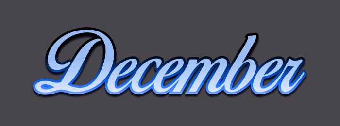
After finalizing the disc design I went right into spicing up the main logo. Nothing complicated really, I chose to use gradients on the text and emboss effects on any outlining components to create depth. Finding the right colors for this step was a challenge but ultimately I decided with these purple and blues to contrast the bright outline. To specify each month’s video entry, I went with a script font decked out in its corresponding month’s birthstone colors.
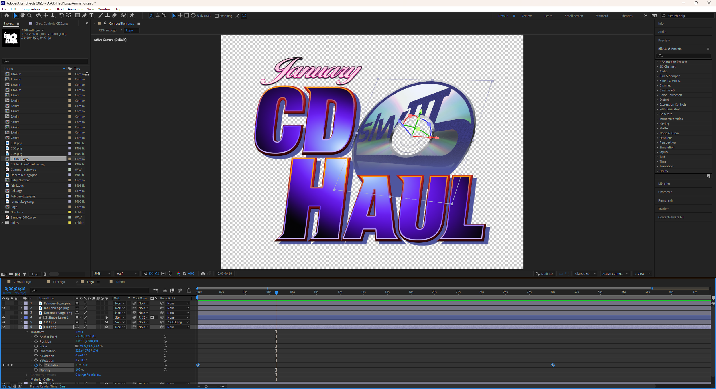


I then took all of the components into Adobe After Effects for final details, like animating the disc spinning, a fade from white effect, and adding sound to accompany the logo.
The animating disc was to invoke the imagery of placing a CD in a top loading player. With everything put together, I now have a logo for my video series!